The Story and Meaning Behind Toyota’s Three Ellipses Logo

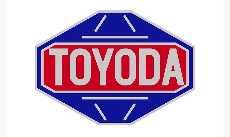
Bet you didn't know but Toyota's logo wasn't always the three ellipses design that you see today. During its early years, Toyota's logo consisted of the word 'TOYODA' placed in the center of a diamond-shaped red and blue symbol.
What's surprising is that the logo retained the original spelling of Toyota's founder, Kiichiro Toyoda, despite the company being called Toyota since 1933. This blue-and-red diamond logo represented the Japanese car manufacturer until 1989.
As the 90s drew nearer and the brand's 50th anniversary loomed, the folks at the company it was time to change the logo, which was starting to look dated, to say the least. The '90s was all about sleekness and curves, and Toyota wanted this to reflect on its new symbol. Fortunately, it stumbled upon a design that not only looked perfect for that decade, but also for the years to follow. That logo that commemorated the company's 50th anniversary is the same one you see today, the one that combines three separate ovals.
According to Toyota, it took designers five years to develop the logo, testing it along the way to ensure its acceptance in many international markets. The new logo debuted on its luxury model the Celsior, in October of 1989. Soon after, it appeared on every Toyota vehicle that left the production line.
At first glance, there may not be a much deeper meaning to attach to the logo. It's just the first letter of the brand, a technique that many companies before and after have adopted, such as the 'U' of Unilever, the 'Y' of Yahoo, the 'F' of Fila, and so on.
However, there's more to the logo than meets the eye, and toyota-global.com provides this explanation:
"The two perpendicular ovals inside the larger oval represent the heart of the customer and the heart of the company. They are overlapped to represent a mutually beneficial relationship and trust between each other. The overlapping of the two perpendicular ovals inside the outer oval symbolize 'T' for Toyota, as well as a steering wheel, representing the vehicle itself. The outer oval symbolizes the world embracing Toyota. Each oval is contoured with different stroke thicknesses, similar to the 'brush' art known in Japanese culture."
Additionally, Toyota wanted a logo that's instantly recognizable even from the rearview mirror--an impressive achievement in symmetry, which only adds to the deepening meaning of the messages that the logo conveys.
But perhaps most impressive of all, is how Toyota incorporated all of the letters of its name into the symbol. Take a closer look below:
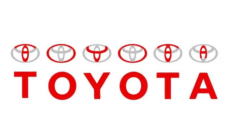
Indeed, when it comes to impressive logo design, Toyota's is right up there with the best. Even with a very minimalist look, the Japanese brand manages to cram a lot of themes and messages, effectively changing the way how logos are designed thereafter.
Featured Articles
- Latest
- Popular
Recommended Articles For You
-
BYD Atto 3 receives updates for 2025Paulo Papa . Jan 22, 2025
-
Things 2nd-hand car owners must check before 2025Paulo Papa . Dec 27, 2024
-
PEVS 2024: event summaryPaulo Papa . Oct 30, 2024
-
Here’s what went down at PIMS 2024Paulo Papa . Oct 29, 2024
-
-
Check out Hero Motorcorp’s 3-model lineup in PHPaulo Papa . Aug 06, 2024
Featured Cars
- Latest
- Upcoming
- Popular
Car Articles From Zigwheels
- News
- Article Feature
- Advisory Stories
- Road Test
-
Isuzu PH updates Sta. Rosa dealershipRuben Manahan IV . Today
-
Ford PH offers up to P600k in savings for Mustang Mach-E this monthCesar Miguel . Today
-
BAIC PH signs Paras family as endorsersPaulo Papa . Today
-
4 reasons why the VinFast VF MPV 7 is the sweet spot for Filipino familiesCesar Miguel . Today
-
BYD gives 2026 Seagull more range, techRuben Manahan IV . May 12, 2026
-
Check out MG 5 Prestige’s similarly-priced rivals in PHCesar Miguel . May 12, 2026
-
Denza D9: 3 reasons to buyPaulo Papa . May 08, 2026
-
Toyota Urban Cruiser: 5 fascinating colorsPaulo Papa . May 07, 2026
-
Check out 4 reasons to buy Kia EV5Cesar Miguel . May 05, 2026
-
5 reasons to be excited about the Geely EX2Paulo Papa . May 05, 2026
-
Tips on how to prevent vehicle firesCesar Miguel . Mar 17, 2026
-
How to prepare your car for summerCesar Miguel . Mar 11, 2026
-
Avoid road trip horror stories this 'Undas' with these tipsRuben Manahan IV . Oct 20, 2025
-
Here are ways to avoid road ragePaulo Papa . Sep 23, 2025
-
How well do you understand traffic signs?Cesar Miguel . Sep 09, 2025
-
ELECTRIA: VinFast VF 6 is a well-equipped urban warriorCesar Miguel . Apr 20, 2026
-
BYD DM-i lineup conquers Southern LuzonCesar Miguel . Mar 10, 2026
-
Hyundai Creta Premium: balancing engaging drive,comfortCesar Miguel . Feb 13, 2026
-
First drive: 4th-gen Changan CS55 PlusPaulo Papa . Feb 09, 2026
-
Changan CS15: small upgrades makes the differenceCesar Miguel . Feb 06, 2026

